Lognormality > Survey Analysis in R with the Likert and NPS Packages
25 November 2017 | | categories: rstats, visualization | blog archive
Navigate: [ background ] | [ survey data ] | [ analysis ] | [
satisfaction analysis ] | [ recommendation analysis ] | [ summary ]
[ Rmd source for this post ]
Recently, I did a survey analysis as part of my board service for Young Guns. I wanted to end up with something along the lines of the picture here. In case it might help someone else, here’s how I approximated this in R. Thankfully, there are some great packages that facilitated this (likert and NPS).
This post:
- does not cover how to create or deliver a survey
- Google Forms and SurveyMonkey offer
free platforms that allow for survey setup/delivery within minutes
- this guide can get you started with a Google Forms survey
- both output to formats that are straightforward to import into R
- Google Forms and SurveyMonkey offer
free platforms that allow for survey setup/delivery within minutes
- provides a simple example that might help you along
- is not a comprehensive guide
- assumes you’re working with numeric (ordinal) survey data and does not cover text mining or sentiment analysis
- quite possibly includes code that could be optimized
- if you have suggestions for optimizing the code, please leave a comment and let me know so I can update the post
First, you’ll need survey data. I assume that if you’re planning to analyze a survey, you’ve already conducted one. I also assume that you know how to import data into R. (If not, this is a good resource.)
Here’s an example survey of 10 questions (5 related to satisfaction and 5 measuring likelihood to recommend) for various aspects of XYZ Corp’s business. All questions are on an 11-point Likert scale where 0 is the worst response and 10 is the best.
- Satisfaction Question #1
- Satisfaction Question #2
- Satisfaction Question #3
- Satisfaction Question #4
- Satisfaction Question #5
- Recommendation Question #1
- Recommendation Question #2
- Recommendation Question #3
- Recommendation Question #4
- Recommendation Question #5
For the purposes of this post, I’m assuming your survey results have already been imported into an R data frame.
In this example, I’ve randomly generated 1,000 survey responses to each of the above 10 questions using the mlsjunkgen package (I may be biased in my choice of RNG). I have arbitrarily chosen 1, 9, 2, and 3 as the seeds:
require(mlsjunkgen)
survey_data <- as.data.frame(mlsjunkgenm(1000, 10, 1, 9, 2, 3, 1) * 10)
Here are the first few responses:
| V1 | V2 | V3 | V4 | V5 | V6 | V7 | V8 | V9 | V10 |
|---|---|---|---|---|---|---|---|---|---|
| 8 | 6 | 7 | 1 | 10 | 2 | 2 | 4 | 4 | 2 |
| 7 | 4 | 7 | 1 | 8 | 6 | 6 | 2 | 2 | 1 |
| 1 | 8 | 5 | 4 | 5 | 9 | 6 | 7 | 7 | 1 |
| 2 | 3 | 8 | 4 | 8 | 6 | 8 | 7 | 0 | 4 |
| 3 | 2 | 5 | 3 | 5 | 8 | 7 | 4 | 9 | 5 |
| 3 | 0 | 4 | 2 | 8 | 9 | 2 | 10 | 7 | 5 |
Of course, this assumes that all respondents answered all questions. That is fairly unlikely, so I’ve randomly replaced an arbitrary 7.5% of responses with NAs based on this stackoverflow response.
survey_data <- as.data.frame(lapply(survey_data, function(cc) cc[ sample(c(TRUE, NA), prob = c(0.925, 0.075),
                                                                         size = length(cc), replace = TRUE) ]))
Here are the first few responses again:
| V1 | V2 | V3 | V4 | V5 | V6 | V7 | V8 | V9 | V10 |
|---|---|---|---|---|---|---|---|---|---|
| 8 | 6 | 7 | 1 | 10 | 2 | 2 | 4 | 4 | 2 |
| 7 | 4 | 7 | 1 | 8 | 6 | NA | 2 | 2 | 1 |
| 1 | 8 | 5 | NA | 5 | 9 | 6 | 7 | 7 | 1 |
| 2 | 3 | 8 | 4 | 8 | 6 | 8 | 7 | 0 | 4 |
| 3 | 2 | 5 | 3 | 5 | 8 | 7 | 4 | NA | 5 |
| 3 | 0 | 4 | 2 | 8 | 9 | 2 | 10 | 7 | 5 |
Now, I’ve given the columns descriptive names:
names(survey_data) <- c("Satisfaction Q1", "Satisfaction Q2", "Satisfaction Q3", "Satisfaction Q4", "Satisfaction Q5",
               "Recommendation Q1", "Recommendation Q2", "Recommendation Q3", "Recommendation Q4", "Recommendation Q5")
| Satisfaction Q1 | Satisfaction Q2 | Satisfaction Q3 | Satisfaction Q4 | Satisfaction Q5 | Recommendation Q1 | Recommendation Q2 | Recommendation Q3 | Recommendation Q4 | Recommendation Q5 |
|---|---|---|---|---|---|---|---|---|---|
| 8 | 6 | 7 | 1 | 10 | 2 | 2 | 4 | 4 | 2 |
| 7 | 4 | 7 | 1 | 8 | 6 | NA | 2 | 2 | 1 |
| 1 | 8 | 5 | NA | 5 | 9 | 6 | 7 | 7 | 1 |
| 2 | 3 | 8 | 4 | 8 | 6 | 8 | 7 | 0 | 4 |
| 3 | 2 | 5 | 3 | 5 | 8 | 7 | 4 | NA | 5 |
| 3 | 0 | 4 | 2 | 8 | 9 | 2 | 10 | 7 | 5 |
This now looks more like real survey data.
Now that I have data, I can begin the analysis.
First, I’ve determined the number of responses and the average score for each question:
## calculate number of responses
num_responses <- sapply(survey_data, function(x) sum(!is.na(x)))

## calculate the avg. of non-na rows for each question
avg <- colMeans(survey_data, na.rm = TRUE)
Here is a summary so far:
| Satisfaction Q1 | Satisfaction Q2 | Satisfaction Q3 | Satisfaction Q4 | Satisfaction Q5 | Recommendation Q1 | Recommendation Q2 | Recommendation Q3 | Recommendation Q4 | Recommendation Q5 | |
|---|---|---|---|---|---|---|---|---|---|---|
| Number of Responses | 937 | 921 | 934 | 932 | 926 | 919 | 926 | 922 | 922 | 918 |
| Average Response | 5.13 | 4.79 | 5.03 | 5.04 | 4.72 | 5.02 | 4.97 | 5.00 | 5.08 | 5.03 |
All questions’ averages are around 5. That doesn’t look good for XYZ Corp. (Given that the data was randomly generated, though, it makes sense.)
I’ve now separated the satisfaction questions into their own data frame for simplicity. I’ll come back to the recommendation questions later.
To keep this simple, here are the assumed ranges for the satisfaction questions:
- 9-10 = Satisfied (SAT)
- 5-8 = Neutral
- 0-4 = Dissatisfied (DSAT)
Using these criteria, I’ve determined the percentage of customers who are satisfied, dissatisfied, etc.
## separate satisfaction questions
sat_num <- survey_data[,1:5]

## calculate percentage sAT
per_sat <- sapply(sat_num, function(x) sum(x[!is.na(x)] >= 9)) / num_responses[1:5]

## calculate percentage neutral
neutral <- sapply(sat_num, function(x) sum(x[!is.na(x)] < 9 & x[!is.na(x)] > 4 )) / num_responses[1:5]

## calculate percentage DSAT
dsat <- sapply(sat_num, function(x) sum(x[!is.na(x)] <= 4)) / num_responses[1:5]

## format percentages
percent <- function(x, digits = 2, format = "f", ...) {
  paste0(formatC(100 * x, format = format, digits = digits, ...), "%")
}

## combine results
sat_results <- as.data.frame(rbind(num_responses[1:5], sprintf("%.2f", round(avg[1:5], 1)), percent(per_sat),
                                   percent(neutral), percent(dsat)))
names(sat_results) <- names(sat_num)
row.names(sat_results) <- c("n", "Avg. Satisfaction", "SAT %", "Neutral %", "DSAT %")
This table tells the story: XYZ Corp. has a problem with customer satisfaction.
| Satisfaction Q1 | Satisfaction Q2 | Satisfaction Q3 | Satisfaction Q4 | Satisfaction Q5 | |
|---|---|---|---|---|---|
| n | 937 | 921 | 934 | 932 | 926 |
| Avg. Satisfaction | 5.10 | 4.80 | 5.00 | 5.00 | 4.70 |
| SAT % | 16.65% | 14.44% | 13.28% | 13.84% | 14.15% |
| Neutral % | 40.13% | 37.02% | 43.04% | 40.99% | 36.50% |
| DSAT % | 43.22% | 48.53% | 43.68% | 45.17% | 49.35% |
I’d like to see something more visual, though. That is where the likert package is useful. It removes the need to go through many of the steps above (calculating SAT %, DSAT %, etc.). It also provides a lot of options for visualization that are beyond the scope of what I’m trying to do here.
likert requires a character data frame, so I’ve created one and filled it with “SAT,” “Neutral,” and “DSAT” based on the above definitions.
## satisfaction classification function
sat_type <- function(elem) {
  if (is.numeric(elem)) {
    ifelse(elem >= 9, "SAT", ifelse(elem <= 4, "DSAT", "Neutral"))
  }
  else { stop("Invalid input.  Please ensure numeric input.") }
}

## apply satisfaction type to sat_num
sat <- as.data.frame(lapply(sat_num, sat_type), check.names = FALSE)
To plot this data, I’ve created a likert data element. I’ve also added the number of responses to each question, so the plot will contain all relevant data:
## add number of responses to the names of the sat data frame so they will appear on the plot
names(sat) <- lapply(seq_along(sat), function(x) paste0(names(survey_data[x]), " (n = ", num_responses[x], ")"))

## load the likert package
require(likert)

## create a likert data element
sat_likert <- likert(sat, nlevels = 3)

## plot sat_likert
plot(sat_likert)
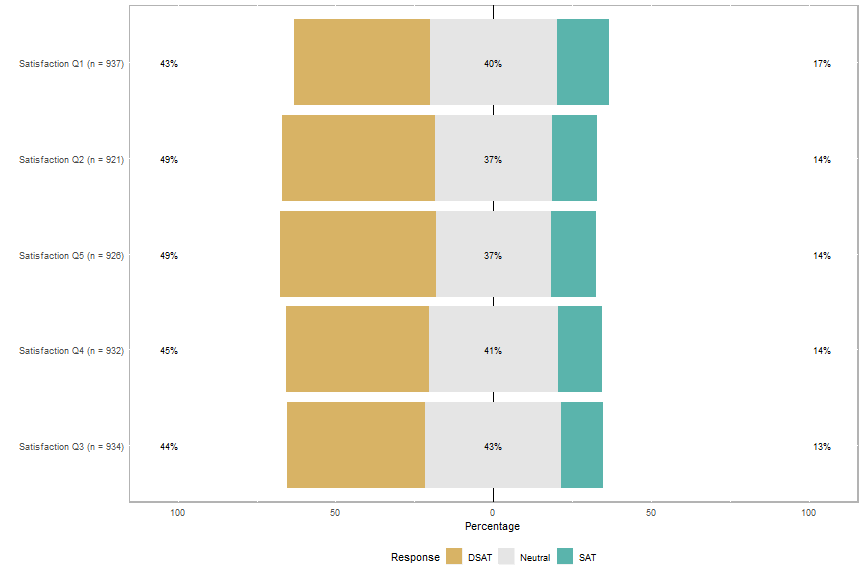
That’s a good start, but there are a few things I would like to change:
- The questions are not displayed in their original order
- The scale is -100% to 100%; 0% to 100% makes sense for satisfaction
- XYZ Corp. wants to see red/yellow/green for DSAT/Neutral/SAT
These can be addressed easily:
- Add
group.order = names(sat)to the plot call - Add
centered = FALSEto the plot call - Define
low.color,neutral.color, andhigh.coloras desired.
## plot sat_likert with questions in original order, changing colors to red/yellow/green and making the range
## 0%-100%
plot(sat_likert, group.order = names(sat), centered = FALSE, low.color = "red", neutral.color = "yellow",
     high.color = "green")
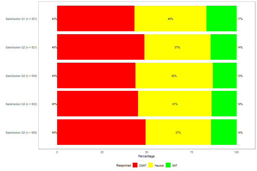
That’s much closer to the desired plot. Average satisfaction is still missing, though. The easiest way I’ve found to add that is annotation. (The likert package extends the functionality of ggplot2, so its features are available.) I’ve already calculated average satisfaction, so annotating the plot with it is straightforward.
## create avg. satisfaction labels
avg_sat_label <- paste0("Avg. Satisfaction = ", sprintf("%.2f", round(avg[1:5], 1)))

## plot sat_likert, adding avg. satisfaction labels
plot(sat_likert, group.order = names(sat), centered = FALSE, low.color = "red", neutral.color = "yellow",
     high.color = "green") +
  annotate("text", x = 5, y = 50, label = avg_sat_label[1], size = 4, alpha = 0.75) +
  annotate("text", x = 4, y = 50, label = avg_sat_label[2], size = 4, alpha = 0.75) +
  annotate("text", x = 3, y = 50, label = avg_sat_label[3], size = 4, alpha = 0.75) +
  annotate("text", x = 2, y = 50, label = avg_sat_label[4], size = 4, alpha = 0.75) +
  annotate("text", x = 1, y = 50, label = avg_sat_label[5], size = 4, alpha = 0.75)

(Note that the x positions of the labels were determined through trial and error and that y = 50 is the
horizontal center of the plot; if this were a -100% to 100% plot, y = 0 would center the annotation.)
This is very close to the desired plot. The labels could stand out a little more, though, so I’ve added white boxes around them. I’ve also added a centered title to the plot so XYZ Corp.’s management knows exactly what they are seeing at a glance.
## plot sat_likert, adding boxes around avg. satisfaction labels
plot(sat_likert, group.order = names(sat), centered = FALSE, low.color = "red", neutral.color = "yellow",
     high.color = "green") +
  geom_rect(aes(xmin = 4.90, xmax = 5.07, ymin = 40, ymax = 60), fill = "#FFFFFF") +
  annotate("text", x = 5, y = 50, label = avg_sat_label[1], size = 4, alpha = 0.75) +
  geom_rect(aes(xmin = 3.90, xmax = 4.07, ymin = 40, ymax = 60), fill = "#FFFFFF") +
  annotate("text", x = 4, y = 50, label = avg_sat_label[2], size = 4, alpha = 0.75) +
  geom_rect(aes(xmin = 2.90, xmax = 3.07, ymin = 40, ymax = 60), fill = "#FFFFFF") +
  annotate("text", x = 3, y = 50, label = avg_sat_label[3], size = 4, alpha = 0.75) +
  geom_rect(aes(xmin = 1.90, xmax = 2.07, ymin = 40, ymax = 60), fill = "#FFFFFF") +
  annotate("text", x = 2, y = 50, label = avg_sat_label[4], size = 4, alpha = 0.75) +
  geom_rect(aes(xmin = 0.90, xmax = 1.07, ymin = 40, ymax = 60), fill = "#FFFFFF") +
  annotate("text", x = 1, y = 50, label = avg_sat_label[5], size = 4, alpha = 0.75) +
  theme(plot.title = element_text(hjust = 0.5)) + ggtitle("Satisfaction with XYZ")
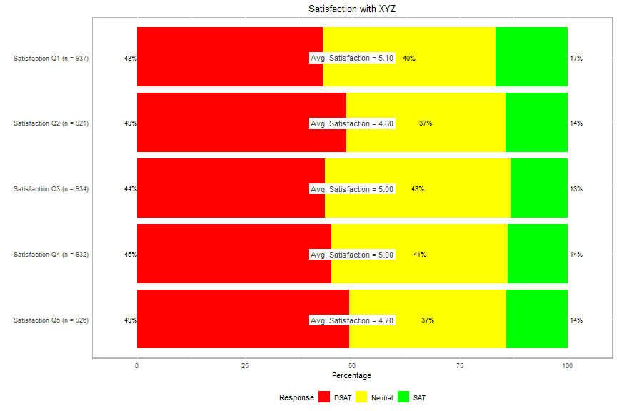 (Again, the size and positions of the boxes were determined through trial and error.)
This looks almost like the desired plot, but I want to see whether the “avg. satisfaction” boxes would look better at their relative positions on the horizontal axis.
## calculate avg * 10 for positioning as the plot's scale is 0-100 and avg's scale is 0-10
avg10 <- avg * 10

## plot sat_likert, moving avg. satisfaction boxes to their relative positions
plot(sat_likert, group.order = names(sat), centered = FALSE, low.color = "red", neutral.color = "yellow",
     high.color = "green") +
  geom_rect(aes(xmin = 4.90, xmax = 5.07, ymin = avg10[1] - 10, ymax = avg10[1] + 10), fill = "#FFFFFF") +
  annotate("text", x = 5, y = avg10[1], label = avg_sat_label[1], size = 4, alpha = 0.75) +
  geom_rect(aes(xmin = 3.90, xmax = 4.07, ymin = avg10[2] - 10, ymax = avg10[2] + 10), fill = "#FFFFFF") +
  annotate("text", x = 4, y = avg10[2], label = avg_sat_label[2], size = 4, alpha = 0.75) +
  geom_rect(aes(xmin = 2.90, xmax = 3.07, ymin = avg10[3] - 10, ymax = avg10[3] + 10), fill = "#FFFFFF") +
  annotate("text", x = 3, y = avg10[3], label = avg_sat_label[3], size = 4, alpha = 0.75) +
  geom_rect(aes(xmin = 1.90, xmax = 2.07, ymin = avg10[4] - 10, ymax = avg10[4] + 10), fill = "#FFFFFF") +
  annotate("text", x = 2, y = avg10[4], label = avg_sat_label[4], size = 4, alpha = 0.75) +
  geom_rect(aes(xmin = 0.90, xmax = 1.07, ymin = avg10[5] - 10, ymax = avg10[5] + 10), fill = "#FFFFFF") +
  annotate("text", x = 1, y = avg10[5], label = avg_sat_label[5], size = 4, alpha = 0.75) +
  theme(plot.title = element_text(hjust = 0.5)) + ggtitle("Satisfaction with XYZ")
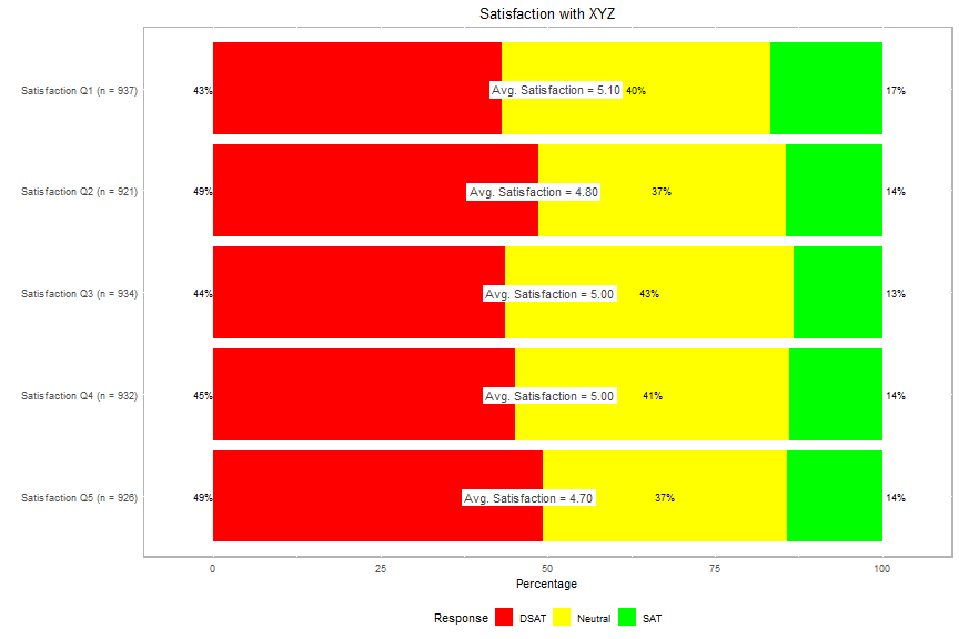
While this is closer to the desired plot, I’m undecided as to whether this looks better than the plot above. If the data were real and not randomly generated (and thus less likely to all be centered around 5), there might be more differentiation in the placement of the labels and this might look better.
I underwent basically the same process for the recommendation questions. For those, I’ve used the standard criteria for calculating Net Promoter Score (NPS):
- 9-10 = promoters
- 7-8 = passives
- 0-6 = detractors
If one is just looking for NPS (% Promoters - % Detractors), the NPS package facilitates this, as it calculates NPS without the interim step of calculating % promoters and % detractors.
Apparently, there is some debate about whether the average score or NPS is a better indicator of customers’ likelihood to recommend a brand. As such, I’ve included both here.
## require NPS package and calculate NPS
require(NPS)
rec_num <- as.data.frame(survey_data[,6:10])
rec_nps <- sapply(rec_num, function(x) nps(x[!is.na(x)]))
Here are the outputs of the nps function from the NPS
package for XYZ’s recommendation questions:
| x | |
|---|---|
| Recommendation Q1 | -0.5255713 |
| Recommendation Q2 | -0.4848812 |
| Recommendation Q3 | -0.4989154 |
| Recommendation Q4 | -0.4793926 |
| Recommendation Q5 | -0.4891068 |
Since NPS is measured on a scale of -100 to +100, I’ve multiplied by 100. I’ve also calculated % promoters, % passives, and % detractors and put everything into a table, similar to the satisfaction table above because if there’s one thing that XYZ Corp.’s management values, it’s uniformity.
## multiply NPS * 100
rec_nps <- sapply(rec_num, function(x) nps(x[!is.na(x)])) * 100

## calculate percentage promoters
promoters <- sapply(rec_num, function(x) sum(x[!is.na(x)] >= 9)) / num_responses[6:10]

## calculate percentage passives
passives <- sapply(rec_num, function(x) sum(x[!is.na(x)] < 9 & x[!is.na(x)] > 6 )) / num_responses[6:10]

## calculate percentage promoters
detractors <- sapply(rec_num, function(x) sum(x[!is.na(x)] <= 6)) / num_responses[6:10]

## combine results
rec_results <- as.data.frame(rbind(num_responses[6:10], sprintf("%.2f", round(avg[6:10], 2)), sprintf("%.2f", round(rec_nps, 2)), percent(promoters), percent(passives), percent(detractors)))
This table tells the recommendation story. Wow, XYZ Corp. is in trouble:
| Recommendation Q1 | Recommendation Q2 | Recommendation Q3 | Recommendation Q4 | Recommendation Q5 | |
|---|---|---|---|---|---|
| n | 919 | 926 | 922 | 922 | 918 |
| Avg. Likelihood to Recommend | 5.02 | 4.97 | 5.00 | 5.08 | 5.03 |
| NPS | -52.56 | -48.49 | -49.89 | -47.94 | -48.91 |
| % Promoters | 13.82% | 15.98% | 15.40% | 16.05% | 15.25% |
| % Passives | 19.80% | 19.55% | 19.31% | 19.96% | 20.59% |
| % Detractors | 66.38% | 64.47% | 65.29% | 63.99% | 64.16% |
I’d also like to see this visually. I’ve skipped the interim steps and am showing only the final two plots. To
differentiate visually from the satisfaction results, these plots use the default colors from the likert package.
Given that the scale of NPS is -100 to +100, I’ve also used the default scale for the plots.
## create recommendation labels including NPS and avg. likelihood to recommend
rec_label <- paste0("NPS = ", sprintf("%.2f", round(rec_nps)), "\n", "Avg. = ", sprintf("%.2f", round(avg[6:10], 1)))

## promoter/detractor function
rec_type <- function(elem) {
  if (is.numeric(elem)) {
    ifelse(elem >= 9, "Promoter", ifelse(elem <= 6, "Detractor", "Passive"))
  }
  else { stop("Invalid input.  Please ensure numeric input.") }
}

## apply recommendation type to rec_num
rec <- as.data.frame(lapply(rec_num, rec_type), check.names = FALSE)

## add number of responses to the names of the sat data frame so they will appear on the plot
names(rec) <- lapply(seq_along(rec), function(x) paste0(names(survey_data[x]), " (n = ", num_responses[x], ")"))

## create likert element
rec_likert <- likert(rec, nlevels = 3)

## plot rec_likert
plot(rec_likert, group.order = names(rec)) +
  geom_rect(aes(xmin = 4.82, xmax = 5.14, ymin = -10, ymax = 10), fill = "#FFFFFF") +
  annotate("text", x = 5, y = 0, label = rec_label[1], size = 4, alpha = 0.75) +
  geom_rect(aes(xmin = 3.82, xmax = 4.14, ymin = -10, ymax = 10), fill = "#FFFFFF") +
  annotate("text", x = 4, y = 0, label = rec_label[2], size = 4, alpha = 0.75) +
  geom_rect(aes(xmin = 2.82, xmax = 3.14, ymin = -10, ymax = 10), fill = "#FFFFFF") +
  annotate("text", x = 3, y = 0, label = rec_label[3], size = 4, alpha = 0.75) +
  geom_rect(aes(xmin = 1.82, xmax = 2.14, ymin = -10, ymax = 10), fill = "#FFFFFF") +
  annotate("text", x = 2, y = 0, label = rec_label[4], size = 4, alpha = 0.75) +
  geom_rect(aes(xmin = 0.82, xmax = 1.14, ymin = -10, ymax = 10), fill = "#FFFFFF") +
  annotate("text", x = 1, y = 0, label = rec_label[5], size = 4, alpha = 0.75) +
  theme(plot.title = element_text(hjust = 0.5)) + ggtitle("Likelihood to Recommend XYZ Corp.")
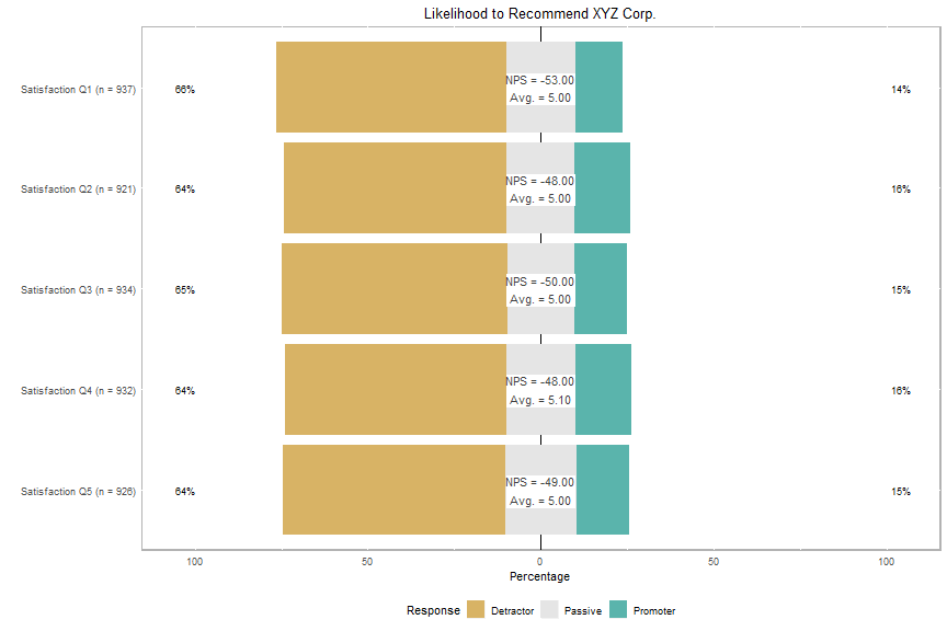
Due to the random nature of the data (centered around the midpoint of the range), the labels cover up the % passives. Here’s one more plot, with the labels in their relative (NPS) positions.
## plot rec_likert, moving labels to their relative positions
plot(rec_likert, group.order = names(rec)) +
  geom_rect(aes(xmin = 4.82, xmax = 5.14, ymin = rec_nps[1] - 10, ymax = rec_nps[1] + 10), fill = "#FFFFFF") +
  annotate("text", x = 5, y = rec_nps[1], label = rec_label[1], size = 4, alpha = 0.75) +
  geom_rect(aes(xmin = 3.82, xmax = 4.14, ymin = rec_nps[2] - 10, ymax = rec_nps[2] + 10), fill = "#FFFFFF") +
  annotate("text", x = 4, y = rec_nps[2], label = rec_label[2], size = 4, alpha = 0.75) +
  geom_rect(aes(xmin = 2.82, xmax = 3.14, ymin = rec_nps[3] - 10, ymax = rec_nps[3] + 10), fill = "#FFFFFF") +
  annotate("text", x = 3, y = rec_nps[3], label = rec_label[3], size = 4, alpha = 0.75) +
  geom_rect(aes(xmin = 1.82, xmax = 2.14, ymin = rec_nps[4] - 10, ymax = rec_nps[4] + 10), fill = "#FFFFFF") +
  annotate("text", x = 2, y = rec_nps[4], label = rec_label[4], size = 4, alpha = 0.75) +
  geom_rect(aes(xmin = 0.82, xmax = 1.14, ymin = rec_nps[5] - 10, ymax = rec_nps[5] + 10), fill = "#FFFFFF") +
  annotate("text", x = 1, y = rec_nps[5], label = rec_label[5], size = 4, alpha = 0.75) +
  theme(plot.title = element_text(hjust = 0.5)) + ggtitle("Likelihood to Recommend XYZ Corp.")
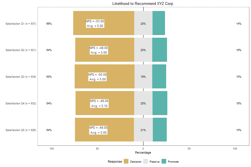
Much better, but bad news for XYZ Corp.’s management.
Numeric survey analysis is relatively straightforward in R, particularly when using the Likert and NPS packages.